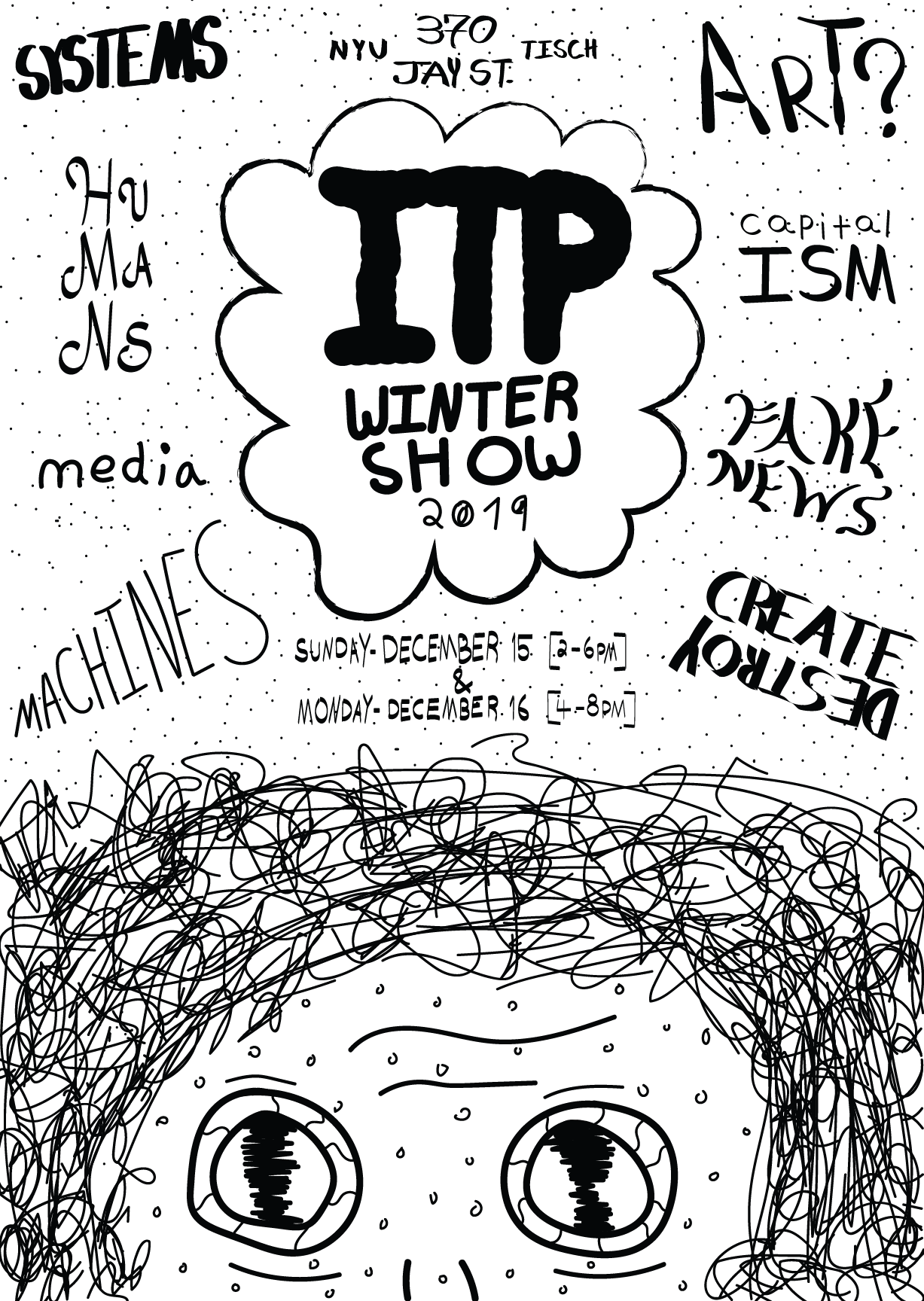
Itp Winter Show Poster
My Design⌗
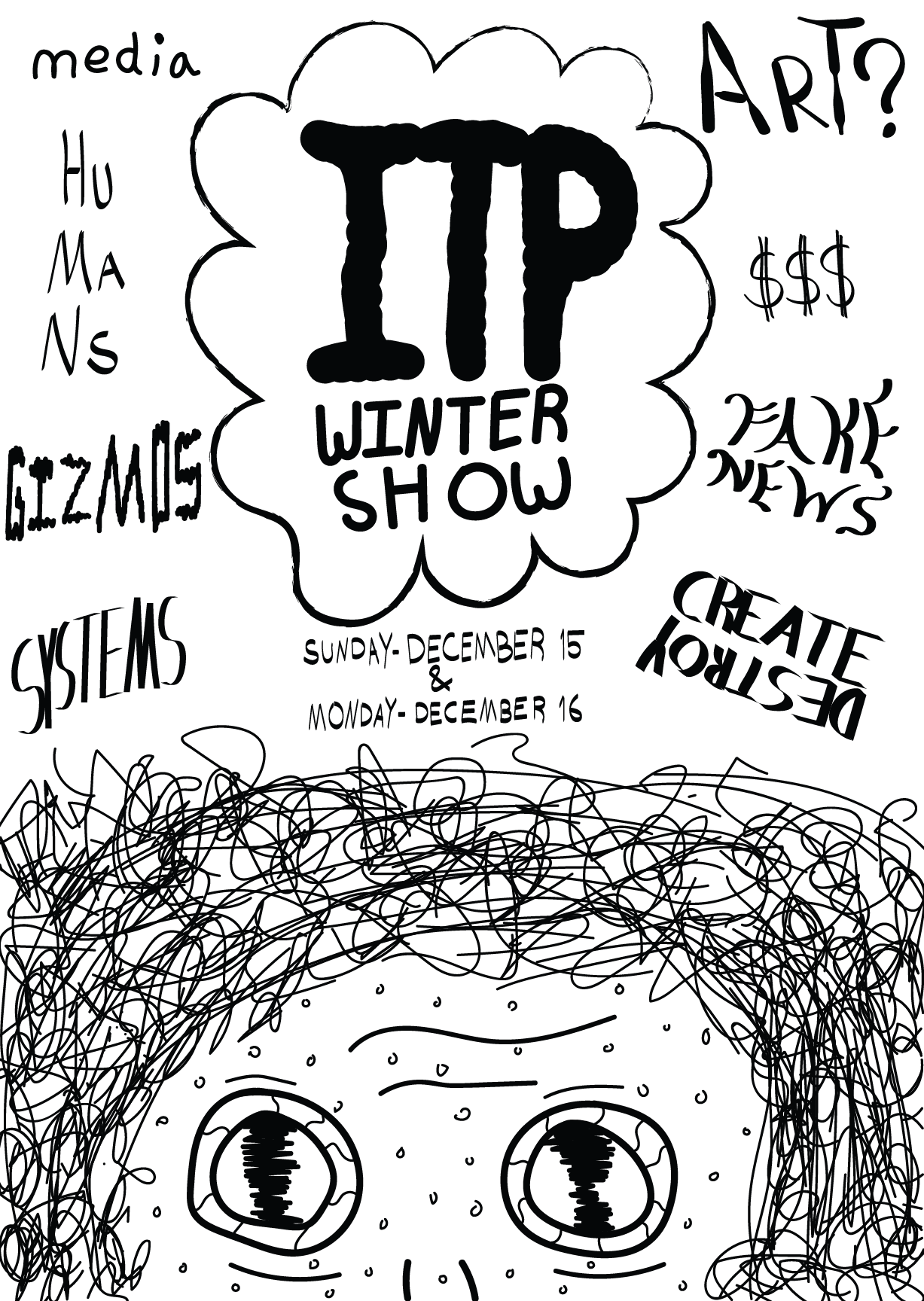
Version 2⌗
After getting critique from my class, I went back to design and made changes.
I added the missing information. Added some background texture. I also made changes to several of the words and their fonts.
The Thinking Part⌗
The prompt for this project, was to make a poster for the Fall 2019 ITP Winter show.
The open call had this line in it:
Hint: we are hoping to see a more humanistic view of ITP – not just breadboards, hamburgers and LEDs
This promept lead me to my idea for the poster. It was to focus on the many elements of what humans do and are. From thinking, to staring eyes, to the noise of the world, and the chaos and creation within ITP.
The face at the bottom is a person staring directly back at the viewer. The eyes convey a sense of wonder, confusion, amazement, and maybe even fear. The hair creates a sense of disarray, wildness, and stress. These are all things I have experienced already in my first 5 weeks at ITP.
The words surrounding the the central thought bubble are all themes and ideas that are front and center in todays world (although it is VERY fair to say that this has United States bias to it.) Their is a cacophony of opinions, voices, and theories flying around and it is enough to make anyone feel crazy.
The thought bubble is the condensing of all of the madness. The person, in this world of noise, is thinking “ITP Winter Show” is where all of these things come together and can be understood (or explored and experimented with).
The Style⌗
The style of the work is also central to the expression of humanism.
For the past 3 years, I have illustrated what I guess could be called comics. I have a distinct style and mostly work in black and white. The style is a very hand drawn look. I mostly work with pens, markers, and brush pens.
The aesthetic is something I developed during the first year or so of teaching myself how to draw. A big part of it is creating something that looks like a human made it. As graphics tools and design practices become more common place, images and designs have become more sleek, minimal, and precise. My work - the style, work, and content - tend to be in tension with this.
After creating an image, I use a series of tools to scan the image and process it a bit. This often creates interesting artifacts as a result of the digital manipulating what was originally analog. This combination of human and technology creates something that is not just from a human or a computer.
This piece was created entirely in Adobe Illustrator. I created my own brushes in an attempt to create strokes that were not as precise as a computer is actually capable of. I wanted to use a drawing tablet as a piece of paper. Although it was created with software - it looks just like a open and paper.
Inspiration⌗
I actually started drawing this with no particular inspiration mind. Halfway through making it, I realized that I was very clearly influenced by the work of Hair Who. Specifically, a poster I had used for a previous example in this class.
If you want to see or read about it, check out my blog post on it!
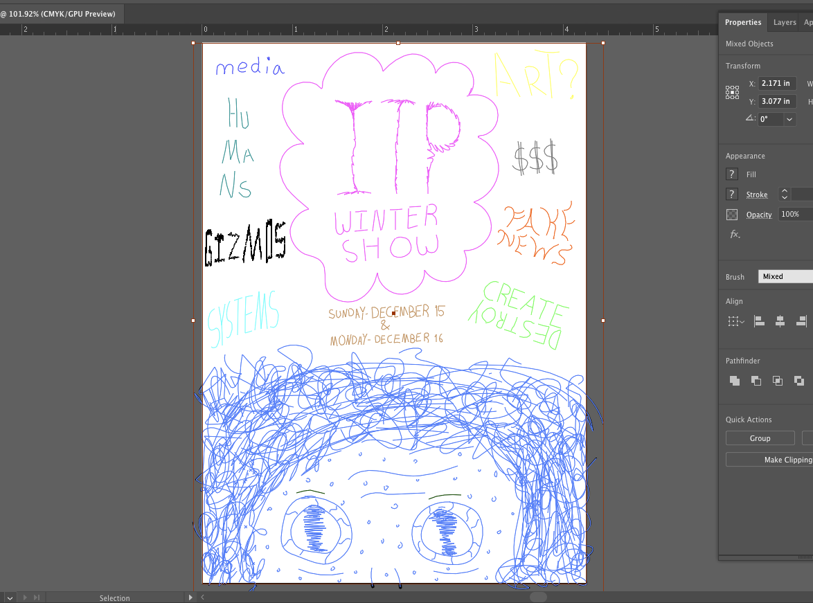
Color?⌗
While editing the photo, I selected all the elements. Adobe illustrators colors each element to mak it easier to see the discrete objects. It gave me a chance to see what it would like in color.
Some of the colors are hard to see, but this is just to see what it would like. Overall, I think I prefer the black and white version.