Expressing Typo Graphy
Three Expressive Words⌗
For the assignment “create three expressive words”, I made the following images.
Human⌗
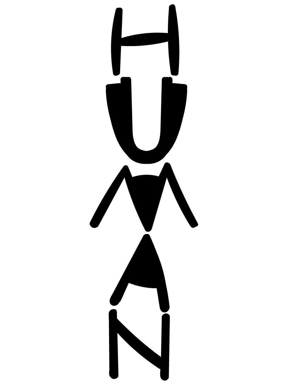
For this idea, I started with some sketches trying to make the human look like a person. I tried giving the character eyes and other elements to make it look - well - human. Most of the tests ended up cluttering the image.
I figured out that by adding larger black blocks I could emphasize the silhouette of a human body.
I also decided to use a hand-drawn look to emphasize the human element of the image.
Unique⌗
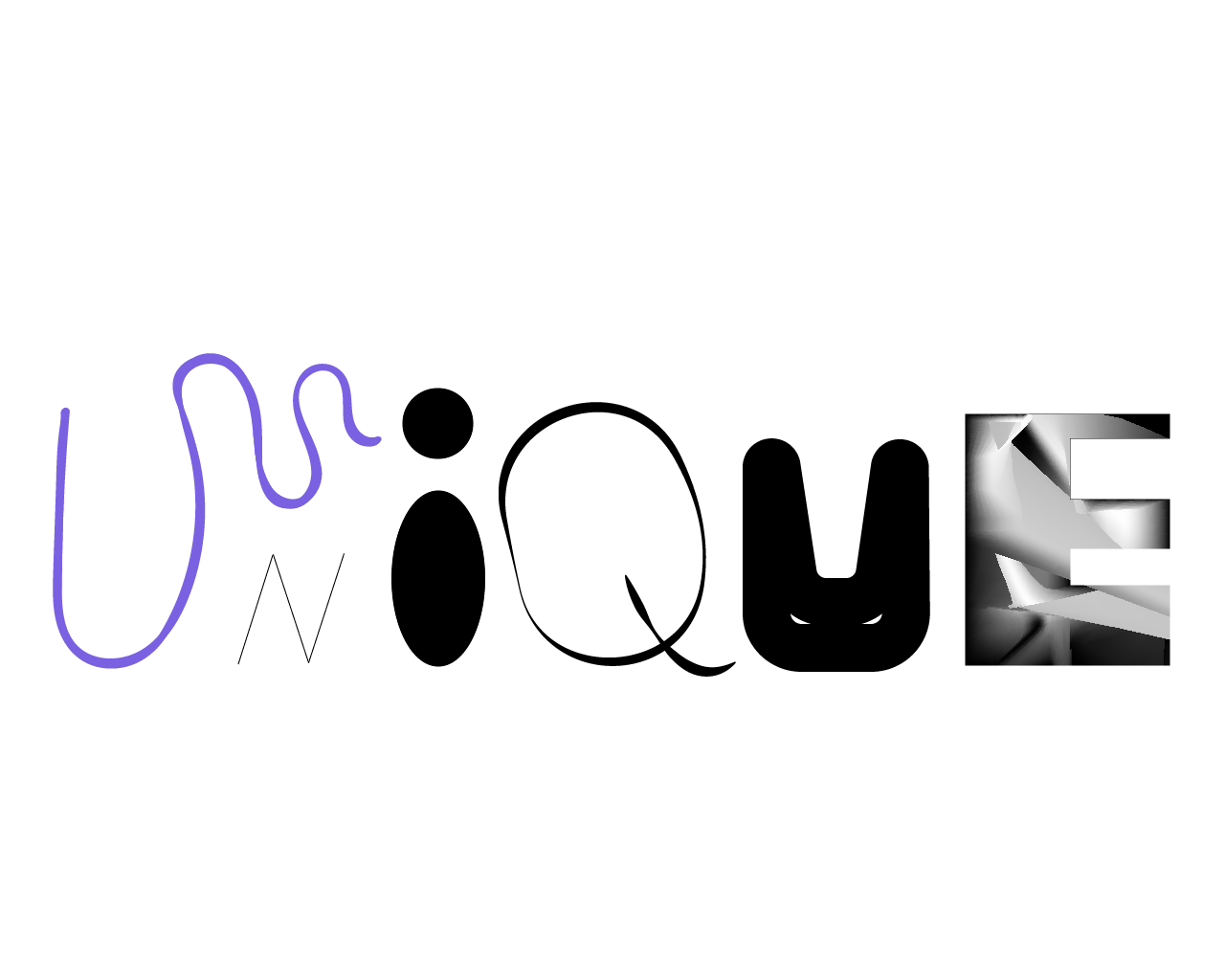
I used this expressive word as an opportunity to experiment with Adobe Illustrator. I knew each letter was going to be unique - but I had no specific guidelines beyond that.
Two letter worth commenting on are the second U and E. For the U, I actually started with the outline of hexagon. Through manipulating the shape and weight of lines, I ended up with the face.
The E involved an experiment with ratios. The top crossbar of the E is 3px; the crossbar below is 6px; and the bottom crossbar is 9px. The vertical stroke is 12px.
Whiskers⌗
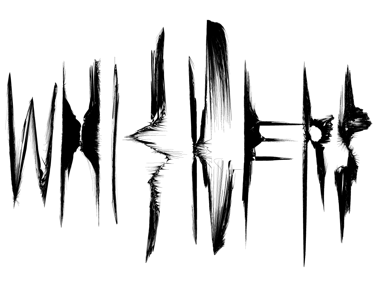
This word was really fun to design. I started by typing out the word WHISKERS, in the font Myriad Pro. I spread the letters out equidistant across the width of the page. I then outlined the text, turning each letter into it’s own object.
To create the “stringing” effect, I used the scallop tool. The process involved a lot of trial and error. Also - the scallop tool creates a lot of new anchor points. This eventually started to slow down my computer. I had created so many anchor points, any time I used the scallop tool, the number of transformations Adobe had to do kept growing at an intense rate.
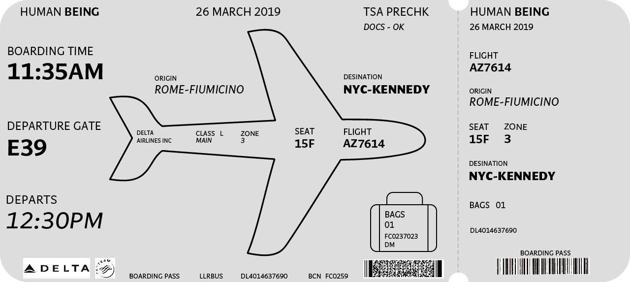
Airline Ticket⌗
For the Airline Ticket redesign I had an idea to use color blocks and orienting the ticket vertically. I ran into several problems trying this and eventually abandoned the idea. I had spent a long while on it though and ended up not having time to try other ideas.
I ended up with something that only barely counts as a redesign. To be honest - it’s a mess I am not proud of. You can look at it if you want…
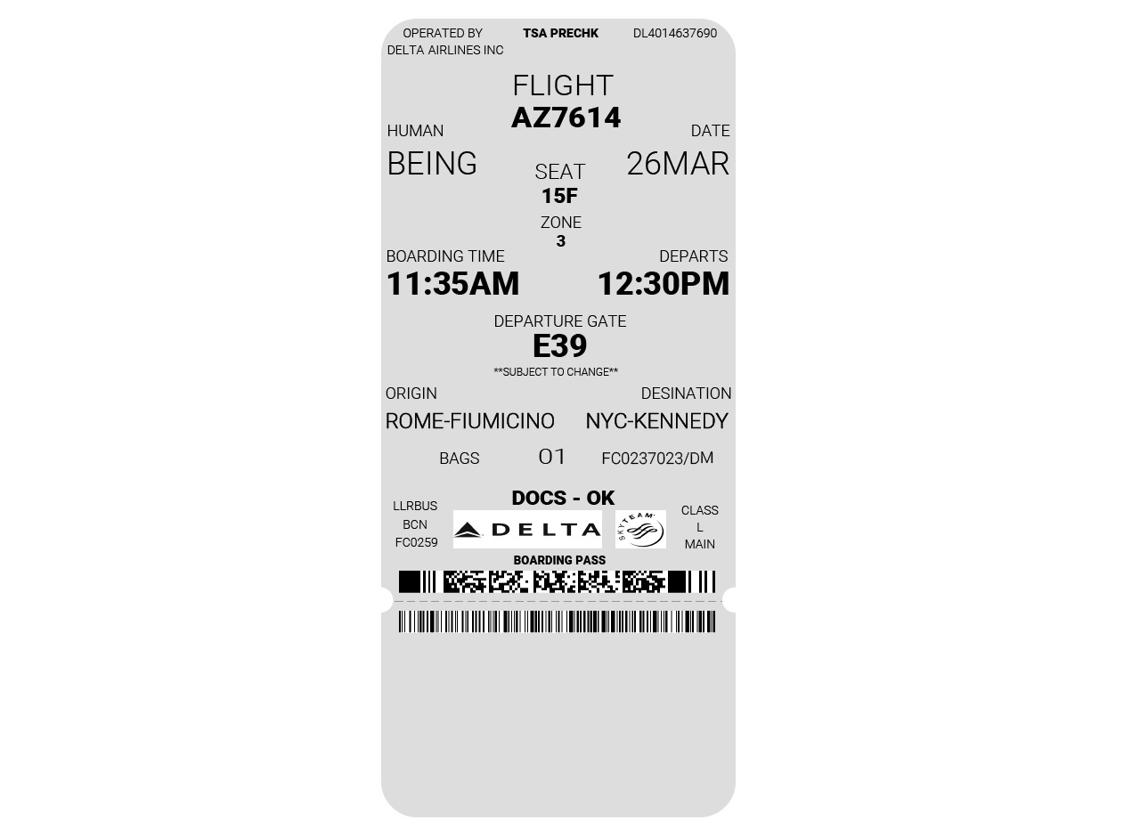
After going to class, and having discussions about everyone’s tickets, I felt disappointed in my effort. the reality is I knew I could do better.
So - I did the assignment again!
I drew a plane in such a way that the wings and tail fins of the plane act as arrows implying a direction from travel. On the left of the ticket is information needed at the beginning of the journey. Things in the body of the plan pertain to information needed for board. To the right of the plane is information related to the destination.
I used font weight and italics to create a hierarchy of importance of information.